
The Design Code / 01
Colour & Contrast
A palette changes how we see.
Colour can draw us closer, create distance or bring a sense of calm. It helps us recognise a familiar object and notice an unexpected detail. Before we read a word or feel a surface, colour has already shaped our first impression.
In clothing, architecture and everyday objects, its effect depends on context: the light, the material and the colours around it.
I
Colour creates mood
A room in warm white feels different from the same room in cool grey. A black cotton shirt has a different presence from black polished leather. The colour may be similar, but the experience changes.
We often associate darker tones with depth and lighter tones with openness. Muted colours can feel quiet; saturated colours can feel energetic. These associations are flexible, shaped by culture, memory and surroundings.
Choosing a palette begins with a question: how should this feel?
II
Contrast creates clarity
Contrast helps the eye understand what matters.
Dark against light creates a clear distinction. Similar tones create a softer transition. A small accent can draw attention to a seam, a sign or a single word.
Strong contrast gives elements definition. Subtle contrast invites a closer look. Both have a place, whether you are composing an outfit, arranging a room or designing a page.
The balance depends on what deserves attention.
III
Repetition creates identity
A palette becomes recognisable through consistent use.
Repeat a combination across clothing, packaging, photography and spaces, and it begins to form a visual language. The relationship between the colours matters as much as the individual shades: which leads, which supports and which appears only occasionally.
A limited palette can leave room for other qualities to stand out—texture, proportion, material and finish.
Explore the palette
01
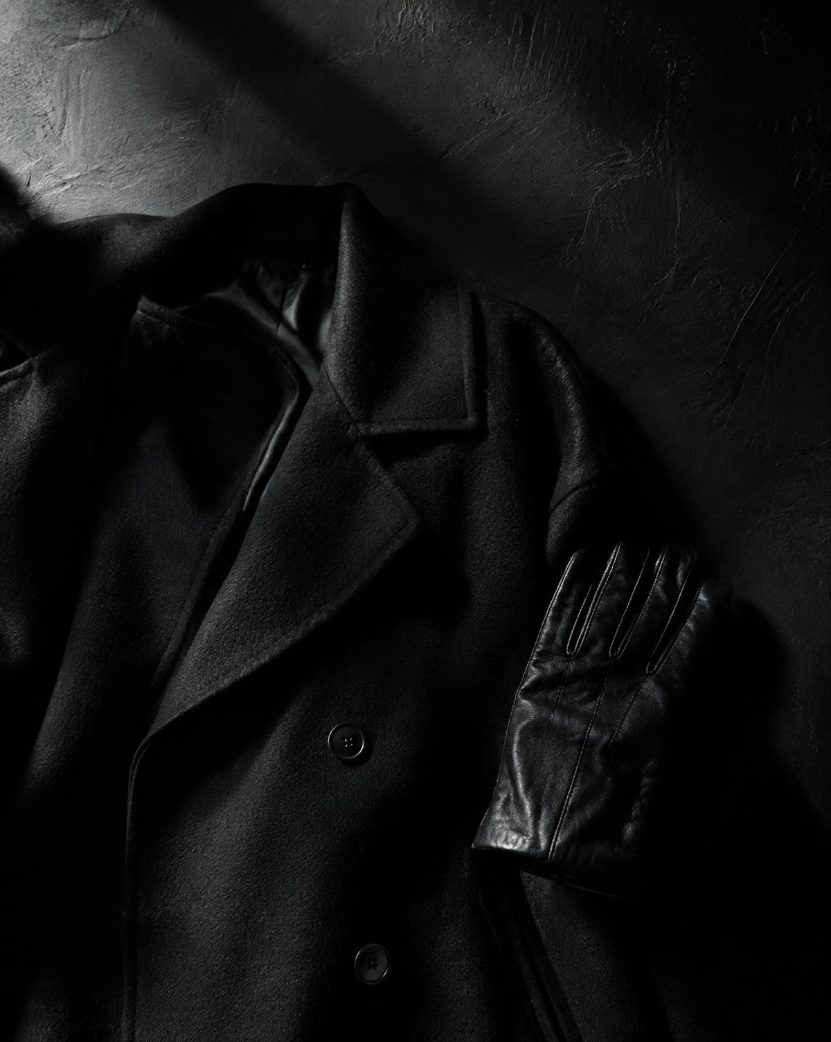
The Power of Black →
Depth, shadow and structure. Discover how light and texture give one colour many different expressions.
02
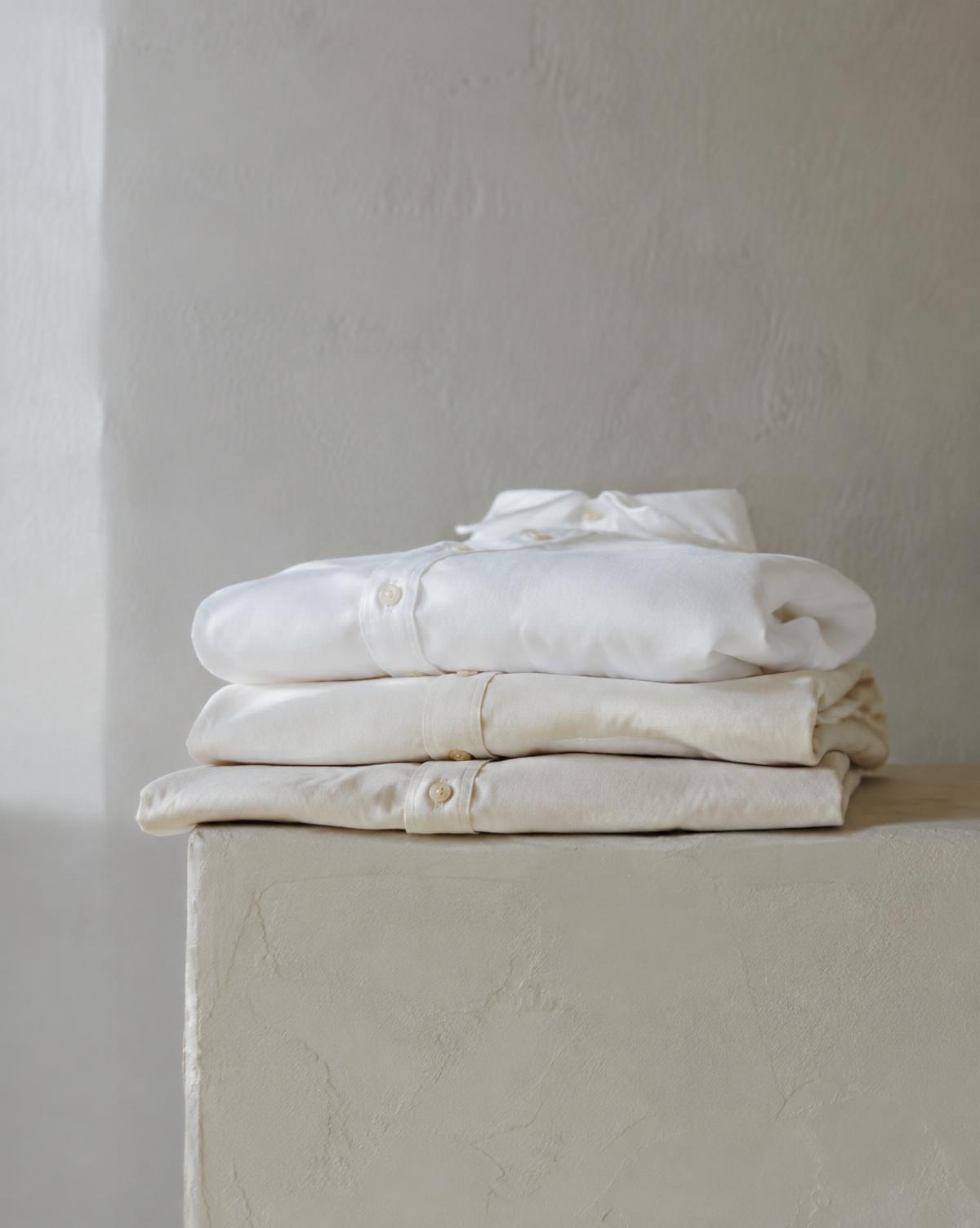
Working with White →
Warm, cool, soft or sharp. Explore how white creates space and changes the colours beside it.
03
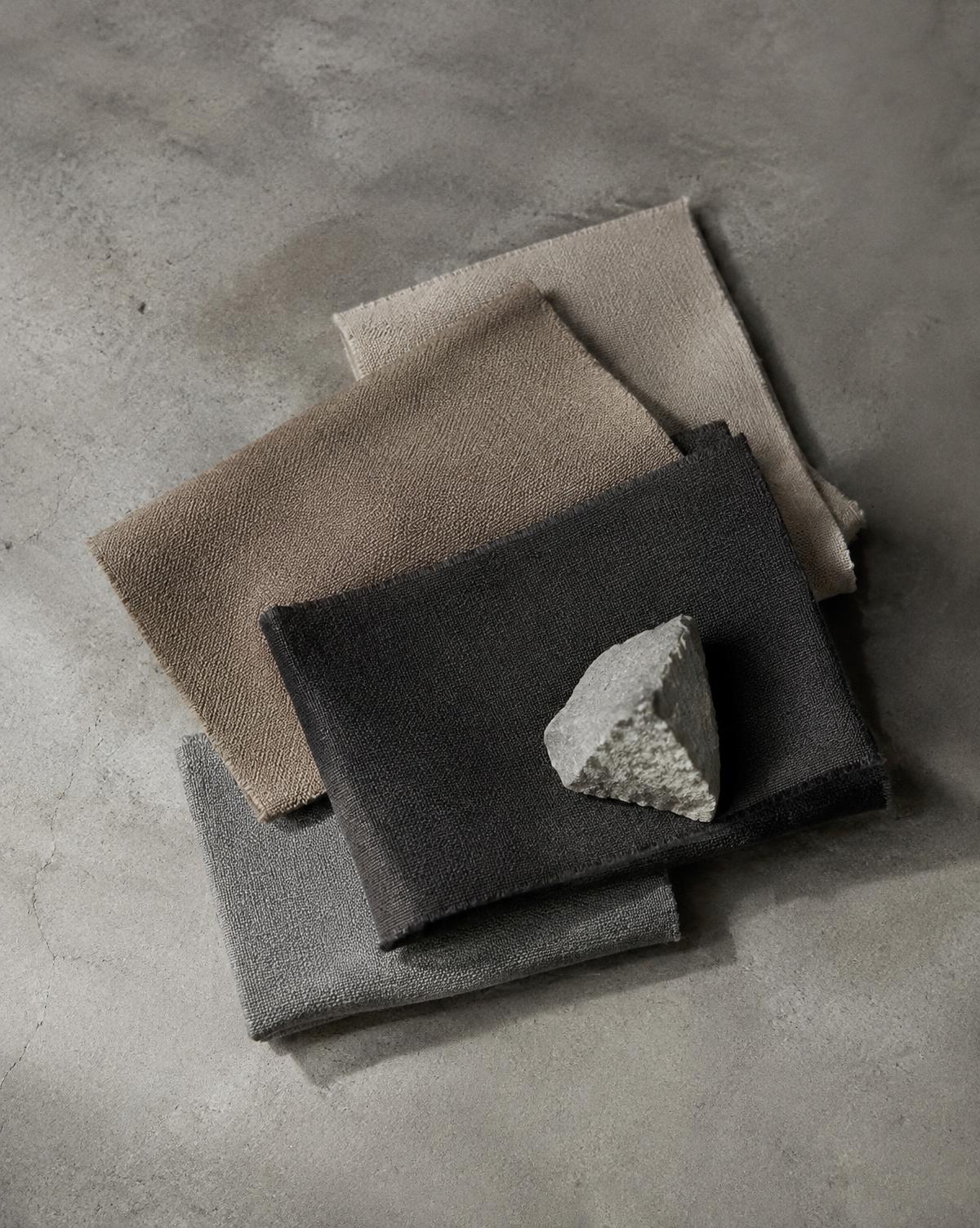
Neutral Palettes →
Stone, sand, charcoal and grey. Understand how subtle differences in tone bring a restrained palette to life.
04
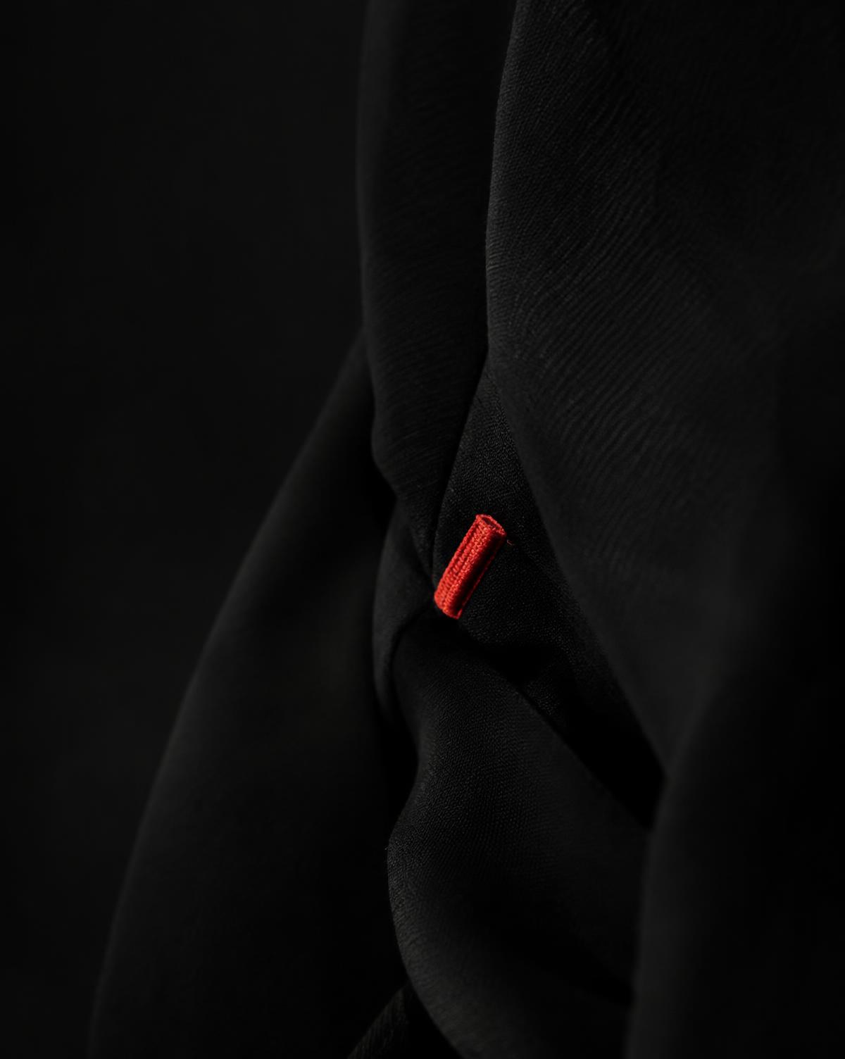
Red as an Accent →
A small detail with a strong presence. Explore how placement and proportion influence the effect of red.
Through the EUVRΛN lens
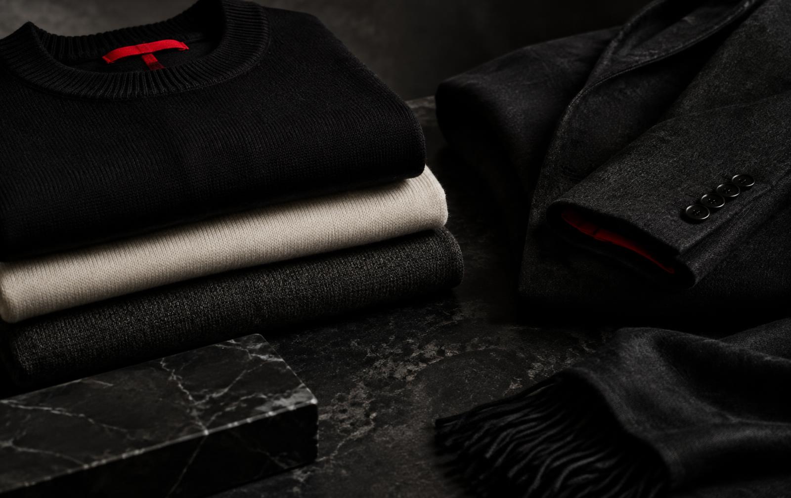
Black and white form the foundation of EUVRΛN’s visual identity. A restrained red detail provides a point of recognition.
Within that palette, fabric and form have room to speak. A weave catches the light. A seam creates a shadow. A small mark becomes visible as you move closer.
Quiet. Minimal. Timeless.
← Back to The Design Code