The Design Code / Colour & Contrast
Red as an Accent
A small detail with a strong presence. How placement and proportion shape the effect of red.
A red stitch on black fabric. A painted edge on a pale object. A single mark on a monochrome page. An accent introduces a point of difference within a larger composition.
Red can serve this role particularly well when the surrounding palette is restrained. Its effect depends on the shade, the surface and how much of it appears.
Working with red as an accent begins with deciding where attention should land.

I
Contrast gives the accent its presence
A colour becomes an accent through its relationship with its surroundings.
Within a black, white or neutral palette, red introduces a distinct hue. That difference can make even a small area noticeable. In a composition already filled with strong colours, the same red detail may be less prominent.
The background also changes how we perceive it. Against white, a red mark can appear crisp and graphic. Against black, its character depends strongly on its brightness: a vivid red may stand out clearly, while a deep burgundy can recede.
The useful question is how the red works with the particular colours around it.
II
Proportion controls the effect
The amount of red changes its role.
A short line of stitching may reward a closer look. A pocket-sized panel becomes a more immediate feature. Across most of a garment or wall, red becomes a dominant colour.
There is no fixed percentage that makes an accent successful. Scale, saturation and contrast all influence how much attention it receives.
Begin with a small area and assess the whole composition. Add more only when it serves a clear purpose. A restrained accent needs enough presence to be noticed, with space around it to remain distinct.
III
Placement gives it purpose
Where an accent appears can matter as much as its size.
A red detail at the end of a seam draws attention to construction. On the edge of an object, it follows the outline. Beside a heading, it creates a starting point for the reader.
Placement also determines when a detail becomes visible. A mark on a cuff may appear as the wearer moves. Colour inside a collar can remain partly concealed. A painted underside may reveal itself only from a lower angle.
These choices create different experiences: immediate recognition, a useful visual cue or a detail discovered over time.
IV
The shade changes the character
Red covers a wide range of colours.
An orange-leaning red can feel bright and warm. A blue-leaning crimson creates a different relationship with neighbouring tones. Brick red is more muted, while burgundy introduces greater darkness.
Choose the shade alongside the materials it will accompany. A red that looks clear on a white screen may appear different as thread, ink or paint.
Physical samples help reveal the relationship more accurately. Look at them in daylight and in the lighting where the finished piece will usually be seen.
V
Material changes the expression
The same red can take on different qualities across different surfaces.
Embroidery introduces raised threads and small shadows. Printed ink may create a flatter mark. Glossy paint catches reflections, while a matte finish gives a softer appearance.
On fabric, the base colour and texture can affect how clearly the accent reads. Fine red stitching may partly disappear into a coarse weave, while a larger embroidered mark remains more distinct.
Colour and construction need to be considered together. The method of applying the red becomes part of the detail itself.
VI
Repetition creates a connection
Repeating an accent can link different parts of a design.
A red mark on packaging might echo a detail on the product inside. Across a website, a consistent red can connect section numbers, small symbols and selected controls.
The repetition works best when its use feels coherent. If every element competes for attention, the accent loses its ability to establish a focal point.
Choose a few roles for the colour and repeat them with care. Consistency in shade, scale and placement helps build recognition.
VII
Meaning depends on context
Red carries many associations, including celebration, urgency, affection and warning. Their relevance changes with culture, setting and use.
A red ribbon around a gift communicates differently from a red indicator on a machine. In clothing, a small red detail may function mainly as a signature, with its meaning shaped by the wider identity of the brand.
Consider what surrounds the accent and what the viewer is being asked to understand.
In practical communication, colour should have support from words, symbols or shape. A red warning needs a clear message; a selected control needs a recognisable state.
VIII
Give the detail room
An accent needs a composition that supports it.
A small red mark surrounded by patterns, bright hardware and several other focal points may be difficult to notice. Against a quieter surface, it becomes easier to read.
This connects colour with negative space. The area around the accent helps establish its presence, just as margins help define a word on a page.
Before enlarging the red detail, consider whether the surrounding elements need simplifying or separating. Sometimes a change in spacing provides the clarity you are looking for.
IX
A closer look
Place a small red object on a black surface, then move it onto white, grey and sand-coloured backgrounds.
Notice how its brightness and prominence seem to change. Move it from the centre towards an edge. Then add a second red object.
Each adjustment changes the balance: where your eye lands, how it moves and whether the red feels like one focal point or part of a repeated pattern.
This is the work of an accent in its simplest form.
Through the EUVRΛN lens
Red provides a point of recognition within EUVRΛN’s restrained visual identity.
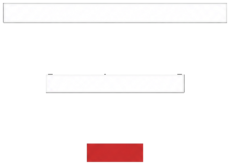
In the three-bar symbol, the red lower bar gives a simple geometric arrangement a distinct detail. Its smaller scale makes proportion part of the signature.
Applied to clothing, the same approach gives a stitch, button or discreet mark a clear role within the wider design. Black, white and neutral tones establish the foundation. Red adds a deliberate point of focus.
Quiet. Minimal. Timeless.
← Back to Colour & Contrast