
The Design Code / Colour & Contrast
Neutral Palettes
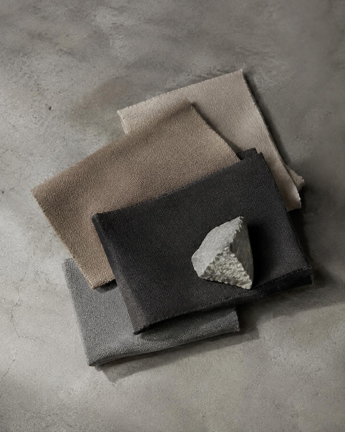
Stone, sand, charcoal and grey. Subtle differences that bring a restrained palette to life.
A sand-coloured shirt against a concrete wall. Charcoal fabric beside pale timber. A cream ceramic bowl on dark stone. Neutral colours reveal their character through the company they keep.
Their differences can be quiet: a warmer undertone, a deeper shade or a surface that catches more light. Together, these variations give a palette depth without requiring strong colour.
Working with neutrals means paying attention to those relationships.
I
What makes a colour neutral?
In everyday design, neutral palettes typically include black, white, grey, beige, cream, taupe and brown. These colours often provide a foundation around which other elements can be arranged.
The boundaries are flexible. A muted olive or subdued navy can play a similar supporting role in an outfit or interior, even though it retains a more recognisable hue.
Neutral colours still have character. A warm sand tone brings a different feeling to a composition from a cool concrete grey. Choosing between them changes the overall impression.
II
Undertones connect the palette
Many neutrals contain traces of other colours.
Beige may lean towards yellow or pink. Grey can suggest blue, green or violet. Taupe often sits somewhere between grey and brown, with its appearance shifting according to the surrounding shades.
These undertones help explain why some combinations feel closely related while others create a noticeable contrast.
A warm cream and sandy beige may sit comfortably together because they share a similar warmth. A cooler grey introduces a different relationship, which can be equally useful when the contrast feels deliberate.
Compare materials side by side in the same light. Undertones are easier to recognise in company.
III
Light and dark give structure
A neutral palette benefits from differences in brightness.
If every element sits within a narrow range of mid-tones, their boundaries may become less distinct. Introducing something lighter or darker gives the eye a clearer way to read the composition.
Imagine an outfit built around sand trousers and a light taupe shirt. A charcoal overshirt adds a darker area that changes the balance. A cream shirt would create a lighter focal point instead.
The same principle applies to a room or photograph. Pale stone, mid-toned timber and dark metal each occupy a different place in the palette, helping individual forms remain visible.
IV
Warm and cool can work together
A palette can stay within one temperature range or bring warmer and cooler tones into conversation.
Warm neutrals such as cream, camel and brown often work naturally with timber and other earthy surfaces. Cooler greys can introduce a sharper contrast, particularly beside smooth metal or concrete.
Mixing the two gives you more possibilities. A warm beige fabric against a cool grey surface can make the qualities of both easier to notice.
Proportion helps hold the combination together. Letting one temperature lead, with the other appearing in smaller areas, provides a clear starting point.
V
Texture adds another layer
Neutral colours leave room for surface differences to become visible.
A coarse linen weave, a smooth cotton fabric and a brushed knit can create variety even when their colours are closely related. Light catches each surface differently, producing small highlights and shadows.
In interiors, a similar relationship might come from plaster, timber and woven fabric. Their shared tones connect them; their textures distinguish them.
When a neutral arrangement feels flat, consider changing a material or finish. A shift in texture may provide all the variation it needs.
VI
Proportion determines the balance
The amount of each colour influences how a palette feels.
A mostly pale composition with a small charcoal detail has a different character from a dark composition with one light element. Both may use exactly the same colours.
Begin with a main tone that occupies the largest area. Add a supporting shade, then consider whether a third tone would help define an edge or draw attention to a detail.
For clothing, the largest areas might be a shirt, jacket and trousers. For an interior, they might be the walls, floor and furniture.
This approach gives each colour a role while leaving room for adjustment.
VII
Three palettes to explore
Sand, cream and charcoal
Sand provides a warm foundation. Cream introduces a lighter layer, while charcoal gives the composition a darker point of contrast.
Imagine sand trousers with a cream shirt and charcoal footwear. The separation between light, middle and dark tones makes each part easy to read.
Stone, grey and black
A cooler combination with a clear range of depth. Pale stone softens the transition between mid-grey and black.
Texture becomes especially useful here: a smooth grey fabric, a subtly grained stone surface or a matte black finish can keep the palette varied.
Ecru, taupe and brown
A palette built around gentle changes in warmth and depth. Ecru brings lightness, taupe provides a middle tone and brown adds weight.
Because these colour names cover a wide range of shades, compare the actual materials. Their undertones will determine how closely they connect.
VIII
Materials make colour specific
Names such as stone, sand and charcoal suggest a colour family rather than one fixed shade.
Actual sand can range from pale cream to deep brown. Stone may be warm, cool, mottled or veined. Two fabrics described as charcoal may look different in daylight.
Use colour names as a starting point, then look at the surface itself. Its texture, finish and surroundings all contribute to the result.
A palette becomes more useful when it is built from real materials rather than names alone.
IX
A closer look
Gather three neutral items: perhaps a shirt, a ceramic cup and a piece of paper or card.
Place them together beside a window. Identify the lightest and darkest. Look for warm or cool undertones, then notice how texture changes their appearance.
Replace one item with a noticeably lighter or darker alternative. Observe whether the arrangement becomes clearer, softer or more contrasting.
Small substitutions can change the balance of the whole.
Through the EUVRΛN lens
Neutral tones extend EUVRΛN’s monochrome foundation with softer transitions and warmer possibilities.
Sand and grey can sit alongside black and white, allowing pieces to combine in different ways. Texture adds interest within the restrained palette, while relaxed proportions shape the overall silhouette.
A small red detail provides a point of recognition among those quieter tones.
Quiet. Minimal. Timeless.
← Back to Colour & Contrast