
The Design Code / Colour & Contrast
The Power of Black
Depth, shadow and structure. One colour, many expressions.
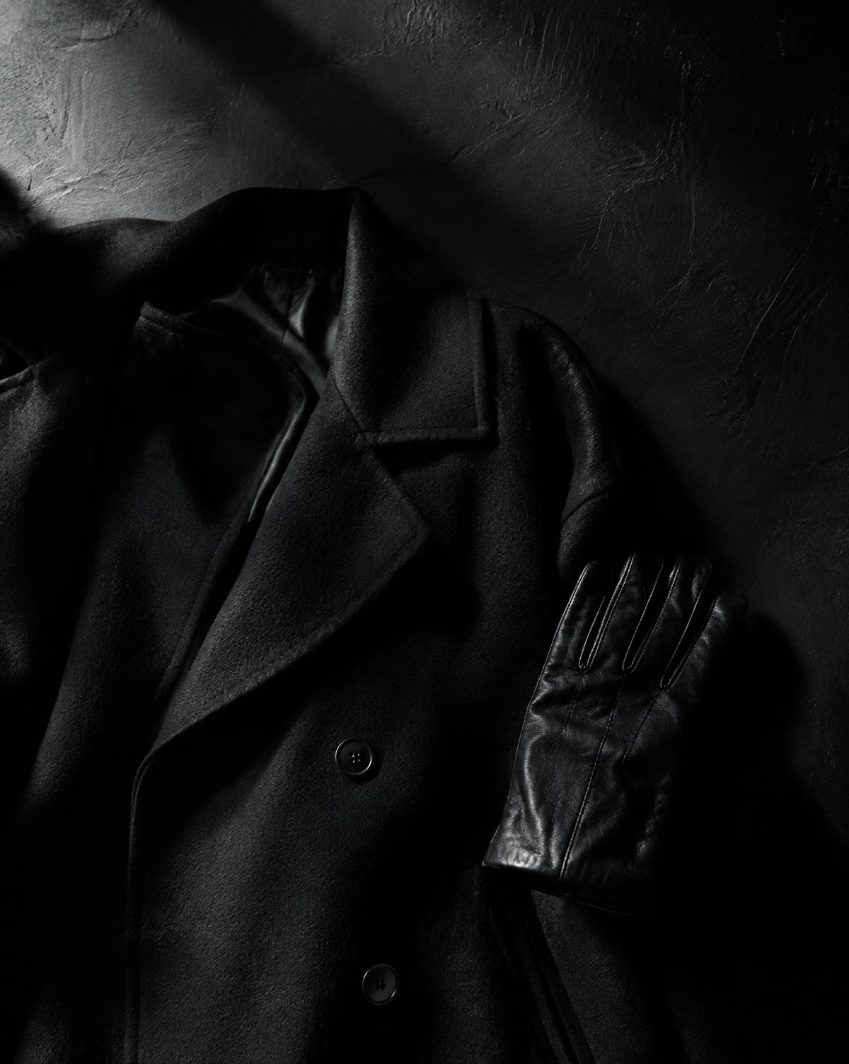
A black wool coat, a polished stone surface and a cotton shirt share a colour, yet each has a different presence. One feels soft and substantial. Another catches sharp reflections. The third changes shape as the body moves.
Black brings these differences into focus. With fewer colour variations competing for attention, we can notice the outline, surface and construction more clearly.
Its versatility begins with the relationship between material and light.
I
Black changes with the surface
Black rarely appears as a single, uniform tone across an object.
On a smooth, glossy surface, reflected light creates bright highlights beside deep dark areas. On a matte surface, the transitions are often softer. A textured weave breaks the light into smaller variations, revealing individual threads, raised fibres and folds.
Imagine three black objects beside a window: a ceramic cup, a linen shirt and a leather bag. The cup may hold a distinct reflection of the window. The shirt reveals its weave through small shadows. The leather catches light along creases and edges.
Their shared colour connects them. Their surfaces give each its character.
II
Light reveals the detail
The direction of light can transform how black looks.
Light falling across a surface from the side reveals ridges, seams and irregularities. More even lighting may make those same details less prominent. In deep shade, separate elements can merge into one dark shape.
This relationship matters in clothing, photography and interiors. A black garment photographed against a dark background needs enough separation for its silhouette to remain visible. A black shelf may become clearer when light catches its front edge.
When looking at a black object, move around it or change its position near a window. Notice which details appear and which recede. The material stays the same, but your reading of it changes.
III
Silhouette becomes more noticeable
Against a lighter background, black gives an outline strong definition.
The slope of a shoulder, the width of a trouser leg or the curve of a chair becomes easy to follow. Proportion takes on greater importance because the overall shape is so clearly visible.
Within an all-black arrangement, the effect can be different. Adjacent pieces may visually merge, creating a continuous silhouette. A change in texture, a fold or a small gap helps distinguish one part from another.
Black can therefore clarify a boundary or soften the distinction between elements. The surrounding tones determine which effect is stronger.
IV
Texture creates variety
A limited palette leaves plenty of room for variation.
Smooth cotton beside a coarse knit. Matte metal against polished stone. A tightly woven fabric beneath a soft, brushed layer. These combinations create contrast through their surfaces.
The differences do not need to be dramatic. A subtle change in finish can be enough to make neighbouring black elements readable.
Consider a black shirt and black trousers. If both have a similar surface and weight, they may appear as one continuous form. If the shirt has a visible weave and the trousers a smoother finish, the outfit gains a different rhythm.
Texture gives the eye something to explore within the shared colour.
V
Not all blacks match
Two items labelled black may look different when placed together.
One may have a slightly blue cast; another may appear warmer or closer to charcoal. The material, dye, finish, lighting and degree of wear all influence what we see.
These differences can become particularly noticeable in daylight. Pieces that seem identical indoors may separate into distinct tones beside a window.
For a closely matched result, compare items together under the same light. For a more varied composition, allow the differences to become part of the design, supported by clear changes in texture or shape.
VI
Contrast directs attention
Black changes the effect of the colours around it.
Beside white, it creates a strong light–dark contrast. With sand or warm grey, the transition can feel gentler. A small red detail may become a focal point within a predominantly black composition.
Proportion matters. A narrow black frame gives an image a boundary. A large black surface changes the balance of an entire room. A tiny coloured stitch asks for a closer look; a broad coloured panel becomes a major element.
Start with the part you want people to notice, then consider how much contrast it needs.
VII
Meaning comes from context
Black can suggest formality, restraint, utility or rebellion. Its associations shift between cultures, occasions and individual experiences.
A tailored dinner jacket, a work boot and a concert T-shirt can all be black while communicating very different things. Cut, material, styling and setting contribute to the impression.
This flexibility makes black useful across many kinds of design. Its character develops through the choices around it.
VIII
A closer look
To understand black in practice, place two or three black objects beside a window.
Notice their undertones. Compare the edges of their reflections. Look at where the deepest shadows sit and how clearly each outline stands against the background.
Then move one object.
A small change in angle may reveal a texture, soften a reflection or make an edge disappear. This simple exercise shows how much variation can exist within a restrained palette.
Through the EUVRΛN lens
Black is a foundation of EUVRΛN’s visual identity. It gives fabric, proportion and subtle detailing room to become part of the expression.
A relaxed silhouette establishes the shape. A visible weave adds depth. A restrained red accent provides a point of recognition.
The result depends on how those elements work together, from the overall outline to the detail seen up close.
Quiet. Minimal. Timeless.
← Back to Colour & Contrast