
The Design Code / Colour & Contrast
Working with White
Warm, cool, soft or sharp. A familiar colour with subtle differences.
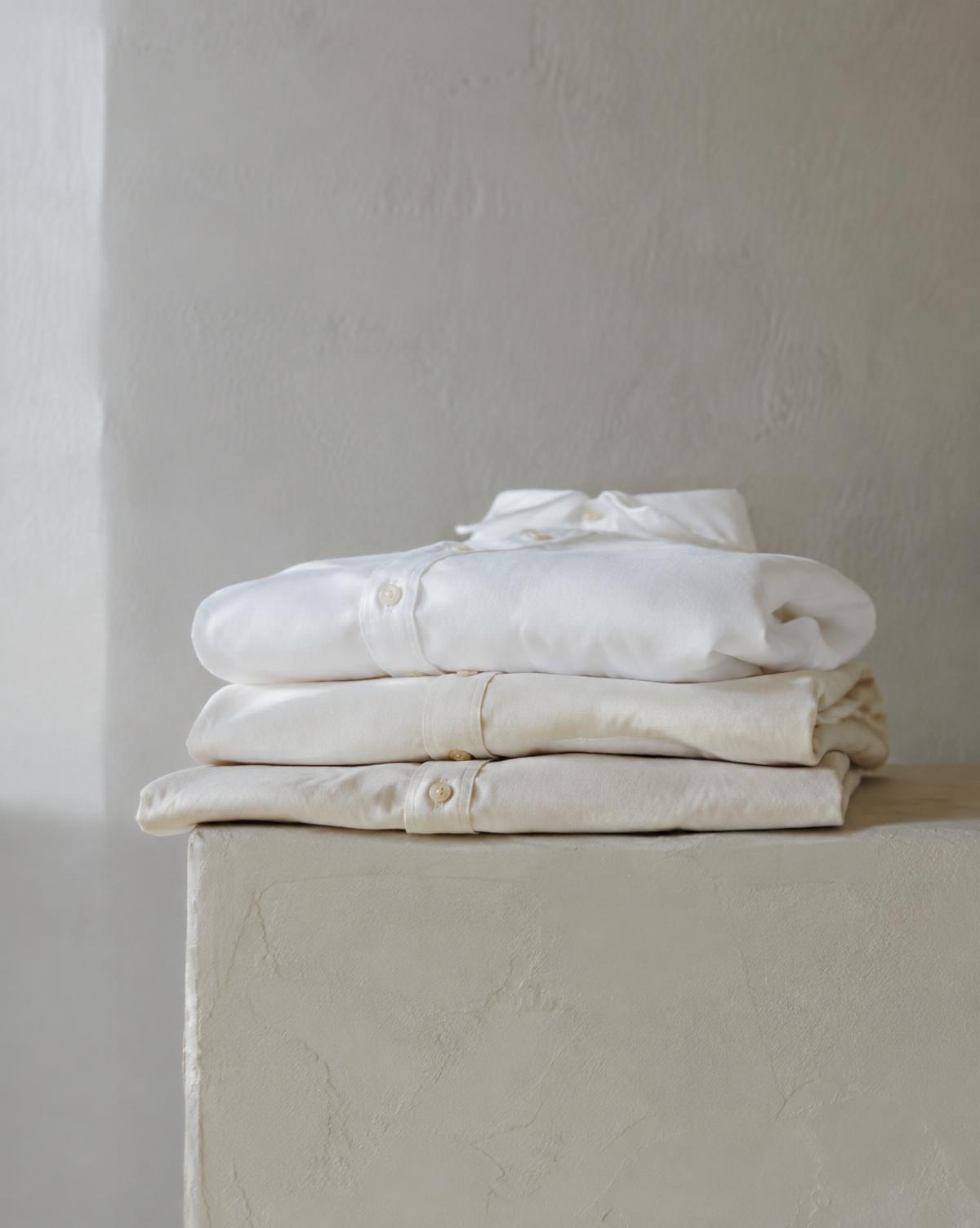
A white cotton shirt, a plaster wall and a glazed ceramic bowl can look quite different beside one another. One may appear creamy, another slightly grey, another bright and crisp.
White reveals the influence of light, surface and surrounding colour. Small differences become noticeable when pale elements meet, giving a restrained composition depth and character.
Working with white begins with learning to see those differences.
I
White has undertones
What we describe as white often contains a subtle hint of another colour.
Warm whites may lean towards cream, yellow or pink. Cooler whites may suggest blue or grey. These undertones can be difficult to recognise in isolation, then become clear when two surfaces sit side by side.
A warm white shirt beside pale grey trousers creates a different relationship from a cooler white shirt in the same outfit. Neither is automatically the better choice. The effect depends on the materials, the light and the overall palette.
Compare whites together before judging them separately. Their differences are often where the interest begins.
II
Light changes the impression
White takes on some of the character of the light around it.
A wall may look warm in late afternoon sun and cooler in shade. A shirt that appears neutral in daylight may look creamier under a warm indoor lamp. Nearby coloured surfaces can also cast reflected light onto white objects.
This makes context especially important. A fabric swatch or paint sample viewed in one setting may look different in another.
Look at white in the conditions where it will be worn or used. If possible, return to it at different times of day. Notice how its relationship with the surrounding colours shifts.
III
Texture gives white definition
An all-white composition can contain considerable variety.
Smooth poplin, textured linen and a soft knit each respond differently to light. Their folds, fibres and surface details create small changes in brightness, helping the eye distinguish one material from another.
The same principle works in interiors. A matte plaster wall, a woven curtain and a glazed bowl share a pale palette while offering different visual experiences.
When colours are closely matched, texture becomes a useful way to create separation. A clear difference in weave or finish can give neighbouring whites their own presence.
IV
Shadows reveal form
On a white surface, shadows help describe shape.
The fold beneath a collar, the curve of a bowl and the recess around a window become visible through changes from light to dark. Gentle shadows reveal subtle contours. Stronger shadows give edges greater definition.
Very even, bright lighting can make these details harder to see. Light from the side often makes them more apparent.
This is part of white’s appeal in clothing and architecture: it provides a light surface across which folds, joints and volumes can be read.
V
White creates breathing room
White is often used to give elements space and clarity.
On a printed page, pale margins separate the text from its surroundings. In an outfit, a visible white layer can create a pause between darker pieces. In a room, a broad white surface can provide a quiet background for furniture or objects.
The effect also depends on arrangement. A crowded white room can still feel busy, while a carefully spaced dark room can feel calm.
Colour and space work together. White provides one way to make those relationships visible.
VI
Contrast changes its character
White takes on a different presence depending on what sits beside it.
With black, it creates a strong distinction between light and dark. Edges appear clear, and the composition can feel graphic. With sand, stone or pale grey, the transitions are gentler.
A small area of white within a dark composition may attract attention immediately. A larger white background can allow darker objects to become the focal points.
Consider both the pairing and the proportions. A white shirt beneath a black jacket creates a different balance from a predominantly white outfit with a narrow black belt.
The amount of each colour matters as much as the combination.
VII
Layering different whites
Whites do not need to match exactly to work together.
Cream, chalk and soft off-white can create a layered palette, particularly when differences in texture help explain the variation. A smooth white shirt beside a warmer, textured overshirt can look deliberate and relaxed.
Very similar whites can be harder to judge. When one appears slightly duller or warmer than the other, the difference may look accidental.
Lay the pieces together in daylight. If the combination feels uncertain, try a clearer distinction in texture or tone, or introduce a neutral colour to separate them.
VIII
Fabric affects coverage
In white clothing, colour alone tells us little about how much the fabric will reveal.
Weight, weave, stretch and construction all affect opacity. A fine white fabric may allow underlying colours or seams to show through, particularly under strong light. A denser fabric may provide more coverage and hold a clearer outline.
Look at the garment in daylight and check how it behaves as it moves or stretches. Pay attention to pockets, layered seams and anything worn beneath it.
These practical details influence the finished appearance just as much as the shade of white.
IX
A closer look
Place a white shirt, a sheet of white paper and a white ceramic object beside a window.
Compare their undertones, textures and shadows. Notice which appears brightest and which feels warmer. Then move one into shade or place a dark object beside it.
The relationships change, even though the objects remain the same.
Looking at familiar materials together is a simple way to become more sensitive to the range within white.
Through the EUVRΛN lens
White brings a lighter expression to EUVRΛN’s monochrome foundation. Alongside black, it gives silhouettes clear definition and allows small details to stand out.
Texture keeps the surface interesting. Proportion determines the balance. A restrained red accent provides a point of recognition.
Whether used as a single layer or the foundation of an outfit, white gives the design room to be seen.
Quiet. Minimal. Timeless.
← Back to Colour & Contrast