The Design Code / 05
Typography
& Symbols
Before you read a word.
Think of a name painted above a shop door. From across the street, you might recognise it by the long stroke of its first letter or the way the whole word fits between two windows. By the time you’re close enough to read it, you already know where you are.
I
The shape of letters
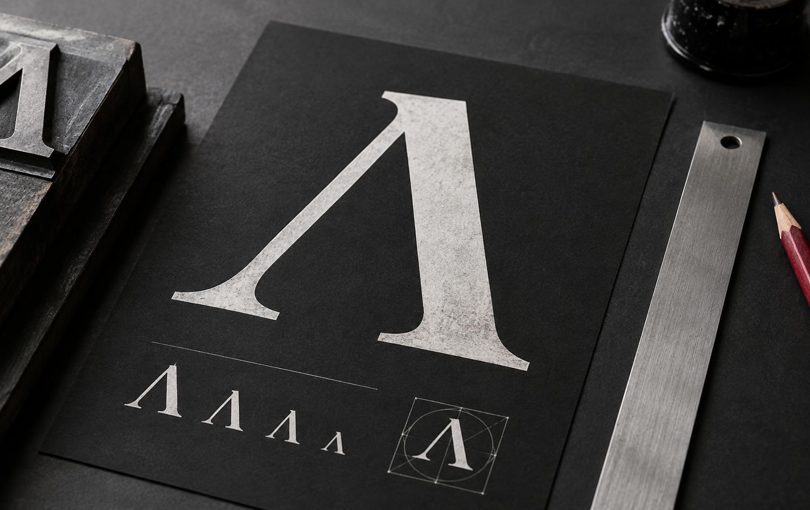
Typography gives words that second life as shapes. Set the same name in tall, narrow capitals and it feels quite different from a line of broad, rounded letters.
Even the gaps have a say. Move two letters closer and their strokes can begin to form a shape of their own.
Even the gaps have a say.
II
Signs that guide us
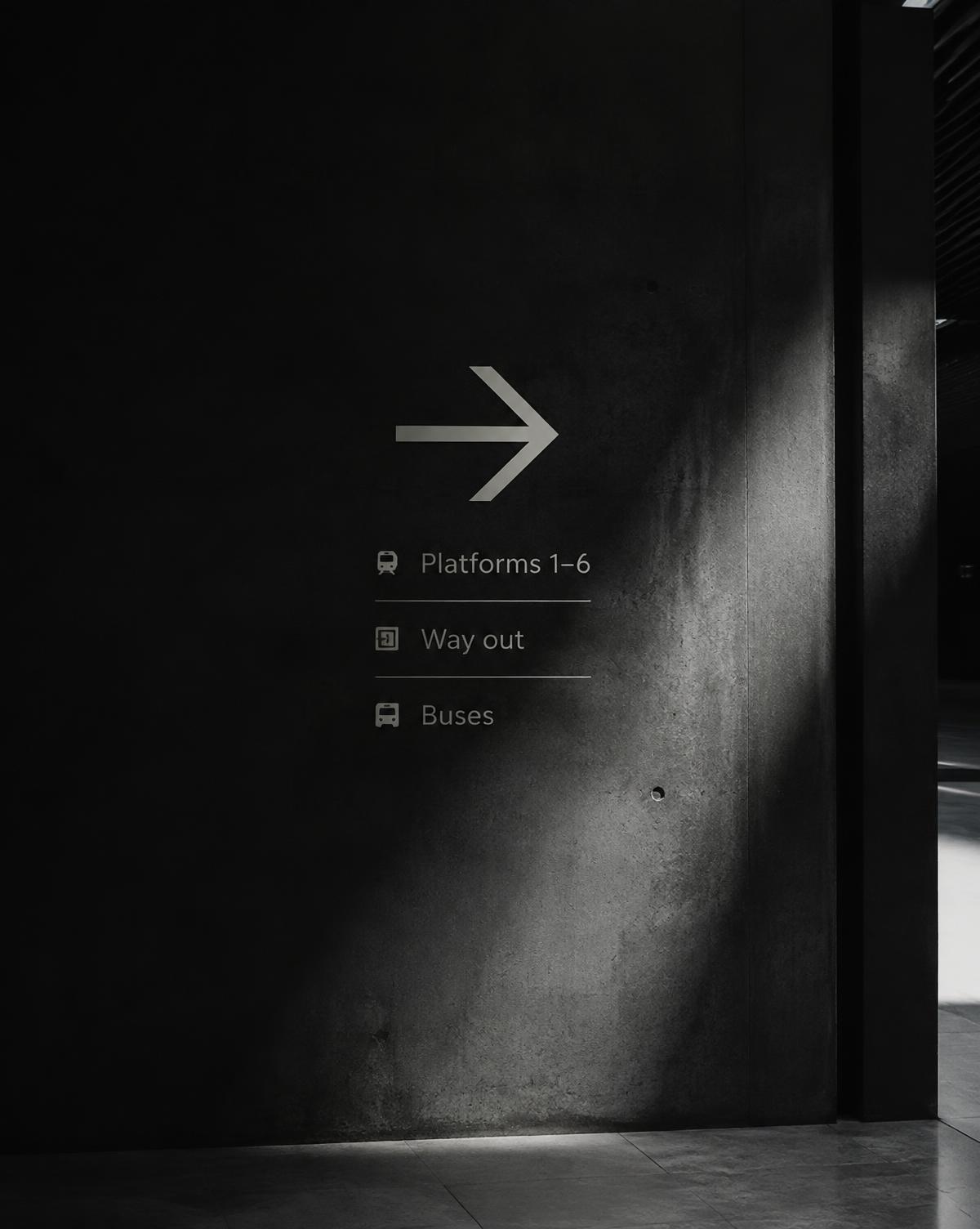
Symbols ask a little more of the eye. An arrow on a station wall can tell you where to turn in a single glance.
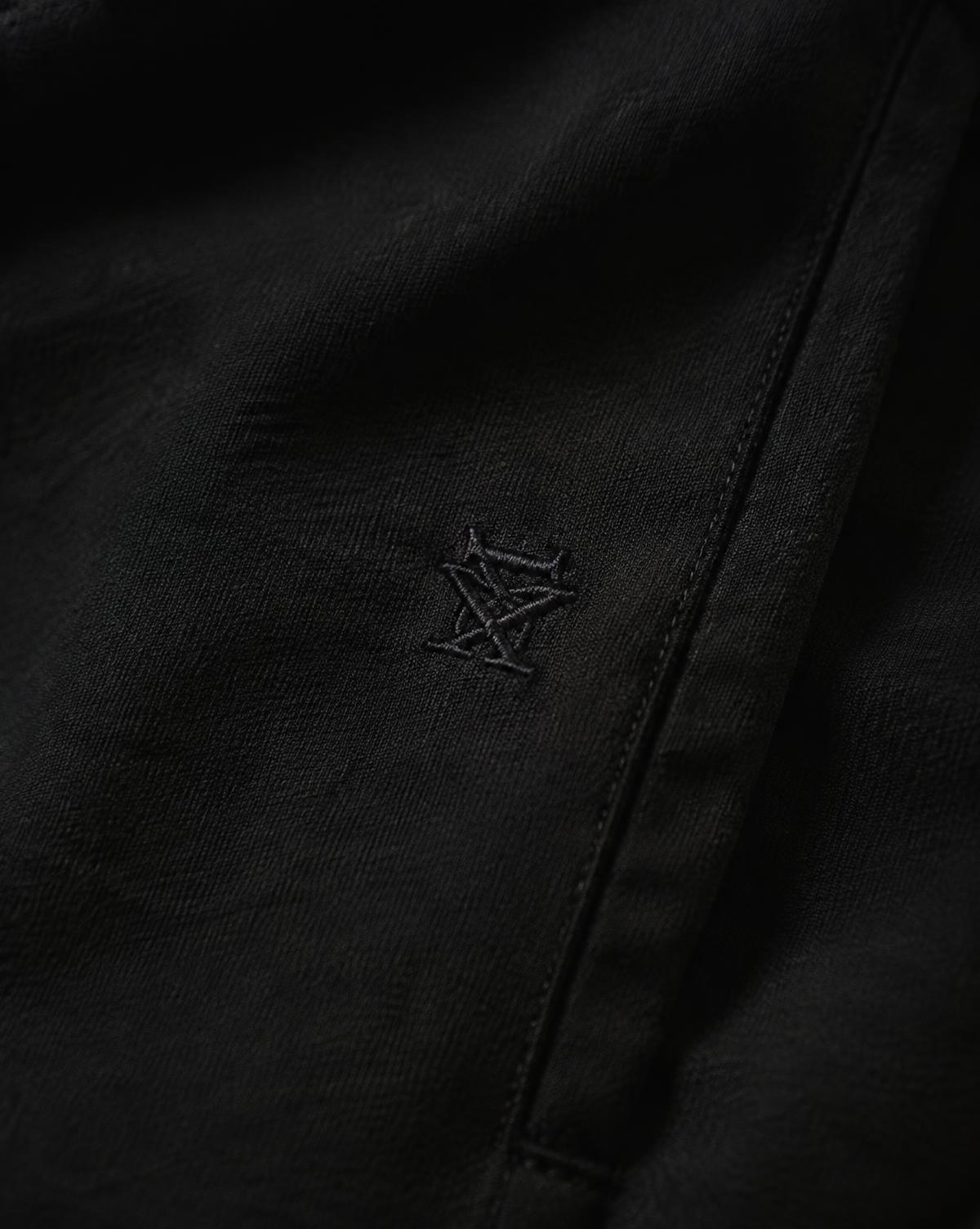
A mark on a garment becomes familiar more slowly. You see it once, then again on another piece, until a small detail is enough to recognise the maker.
A small detail is enough to recognise the maker.
Explore Typography & Symbols
01
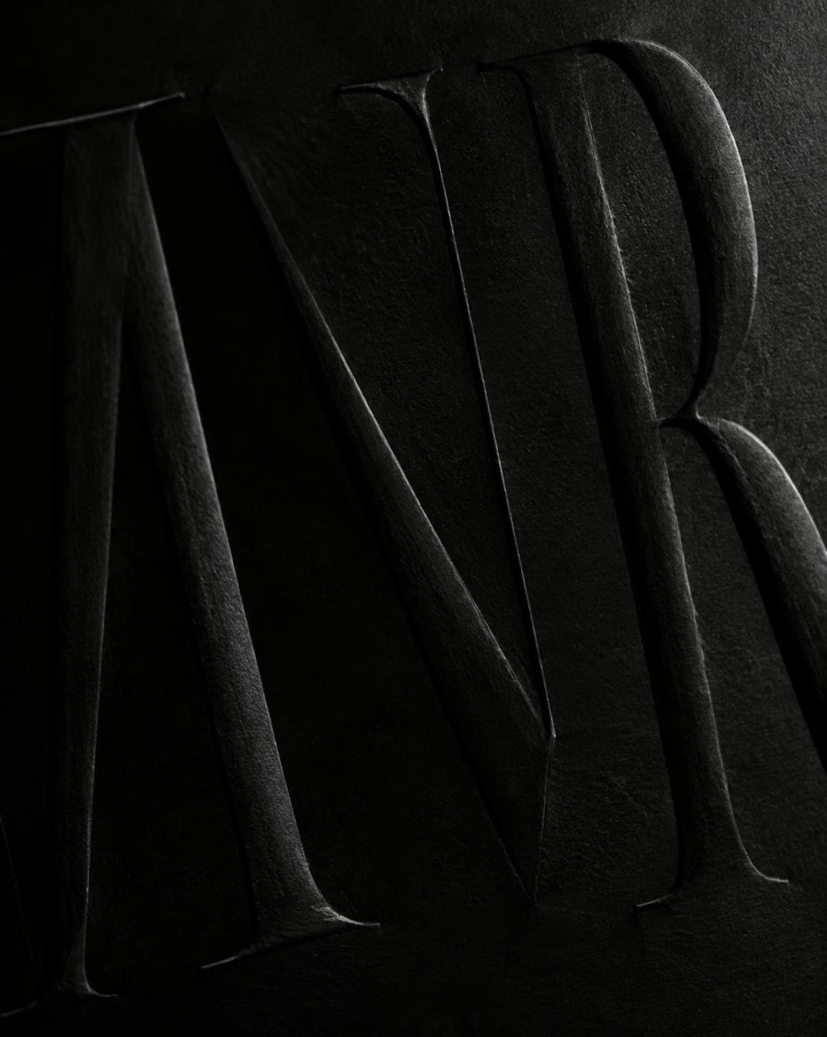
The Shape of Letters →
Look closely at the curves, angles and spaces that give a word its character.
02
Signs That Guide Us →
Follow the arrows, letterforms and pictograms that help us find our way through a city.
03
When a Mark Becomes Familiar →
Explore how a simple symbol gathers meaning each time we encounter it.
04
The EUVRΛN Signature →
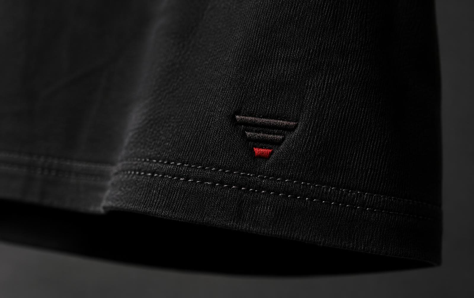
A closer look at the Λ, the three bars and the place of subtle branding on a garment.
Through the EUVRΛN lens
In EUVRΛN, the open space beneath the Λ gives the eye a place to pause. The three bars take that idea further.
On a piece of clothing, there’s room for a signature you discover up close.
Quiet. Minimal. Timeless.
← Back to The Design Code