The Design Code / Typography & Symbols / 04
The EUVRΛN Signature
The Λ, the three bars and the place of subtle branding on a garment.
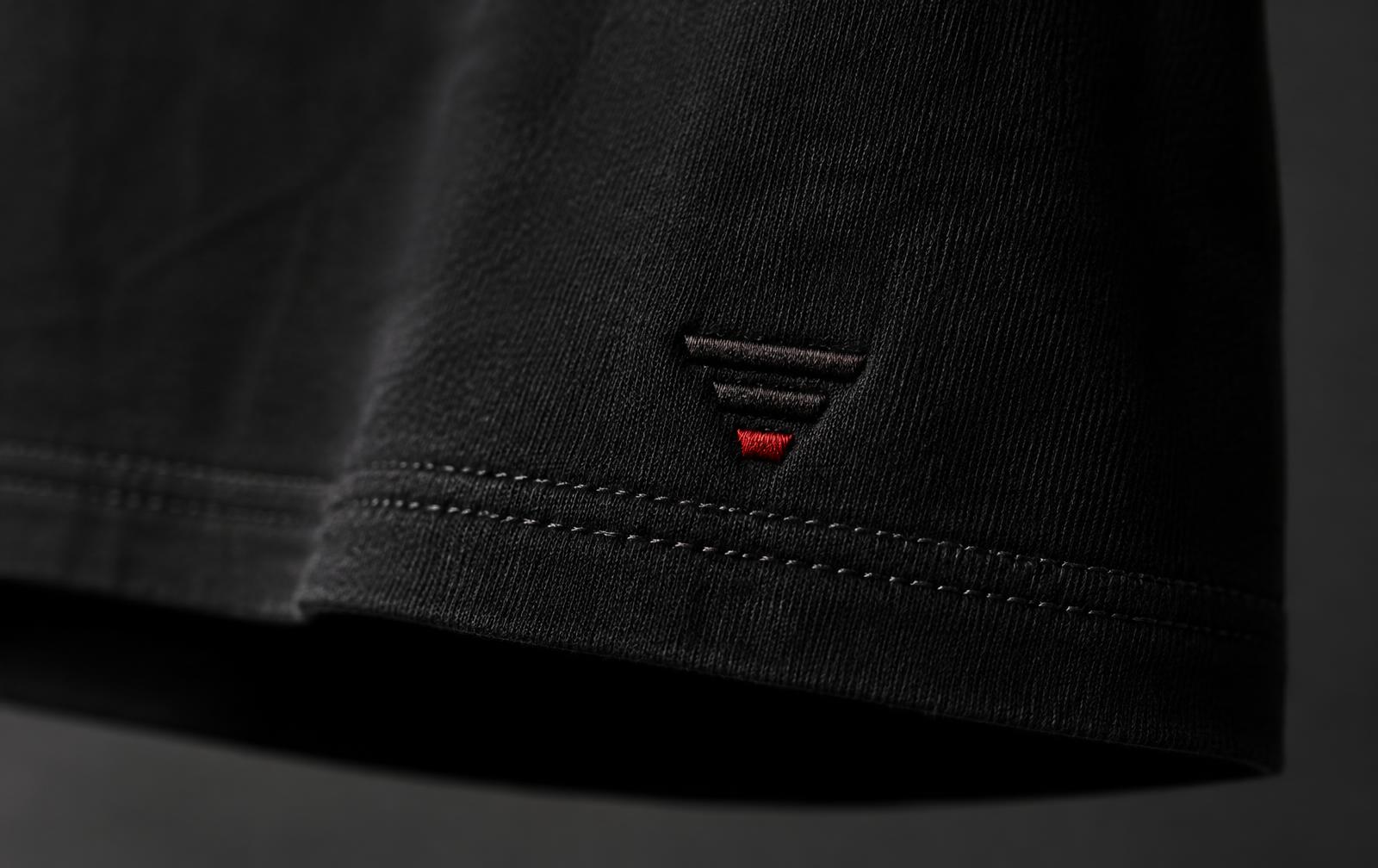
Look at a black EUVRΛN shirt from a few steps away. Near the lower left hem, you might catch a short line of red. Come closer and two black bars appear above it. The uppermost is the longest. Each one below it is shorter, until the three together form an inverted pyramid.
What looked like a single red stitch at a distance was the bottom of the mark all along.
I
The open letter
Read the name EUVRΛN and notice what happens between the R and the N. Where you expect the crossbar of an A, the Λ leaves an open space. Earlier in the word, the V makes the same shape the other way up. Trace the two with a fingertip and you can feel how closely they’re related.
The wordmark and the three bars give EUVRΛN two ways to sign a piece. One lets you read the name. The other fits into a space small enough for a few stitches.
One lets you read the name. The other fits into a space small enough for a few stitches.
II
Why the bottom bar is red
Red occupies the smallest part of the symbol. Its position matters as much as its colour. Place it on the longest bar and the eye goes straight to the top. On the shortest, it draws your gaze to the narrow end of the pyramid. Even with the three bars in full view, that small line gives your eye somewhere to settle.
On black cloth, the upper bars are tonal. You see them through the slight relief of the thread and the light along the stitches. As the wearer moves, those bars become easier or harder to distinguish. The red remains the easiest part to pick out.
Red occupies the smallest part of the symbol. Its position matters as much as its colour.
III
A place on the garment
At the lower left hem, the signature sits outside the part of a shirt you usually notice first. There’s room to take in the stand collar, the three buttons and the way the fabric falls from the shoulders. The mark comes into view a little later, perhaps as the wearer reaches into a pocket and the hem shifts.
For the person wearing the shirt, the order is different. You see those bars when you take it off the hanger or smooth the hem before leaving home.
A detail someone else might only glimpse is one you get to know by heart.
Quiet. Minimal. Timeless.
← Back to Typography & Symbols