The Design Code / Typography & Symbols / 03
When a Mark Becomes Familiar
How a simple symbol gathers meaning each time we encounter it.
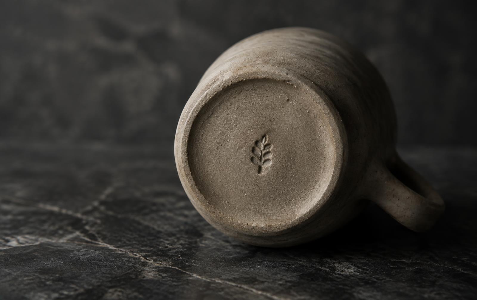
Turn over a favourite coffee cup and you might find a potter’s stamp pressed into the clay. Perhaps you noticed it once while washing up. Months later, you pick up a bowl in a shop, turn it over and recognise the same little impression.
You may have forgotten the potter’s name. Your eye has kept hold of the shape.
I
What the eye remembers
Think of a mark you know well and try drawing it from memory. You might get the proportions slightly wrong and still catch the detail that makes it recognisable. A break in a circle. Two strokes that meet at an unusual angle. A short bar sitting just below a longer one.
Try changing that one detail in your sketch. Close the circle or turn the angle the other way.
It takes surprisingly little for a familiar shape to start looking like somebody else’s.
II
The places we learn to look
On a pair of jeans you’ve owned for years, your hand knows which pocket holds your keys. Your eye can learn a location in much the same way. See a small mark near the hem of one shirt and you may glance towards the same spot on the next.
A change of material makes recognition more interesting. On a paper label, you can follow the clean edge of a printed line. In dark thread on dark cloth, you might first see only a raised edge where a stitch catches the light. The fold shifts and the rest of the shape comes into view.
Your eye can learn a location in much the same way your hand learns a pocket.
III
What a mark comes to mean
Wear a shirt on enough ordinary days and its smallest details become yours. The cuff softens. The label curls after washing.
A few stitches near the hem become as familiar as the feel of the collar.
A few stitches near the hem become as familiar as the feel of the collar.
Through the EUVRΛN lens
Later, you catch sight of the same mark on a shirt across a café.
For a second you remember your own, still hanging on the back of the kitchen door.
Quiet. Minimal. Timeless.
← Back to Typography & Symbols