The Design Code / Typography & Symbols / 01
The Shape of Letters
The curves, angles and spaces that give a word its character.
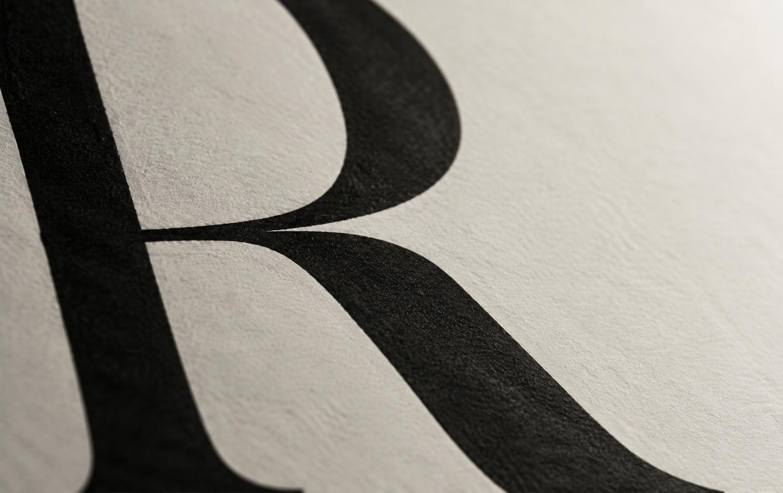
Look closely at a capital R. Cover its diagonal leg with your thumb and what remains looks like a P. Uncover it and notice where that leg lands. In one typeface it drops almost straight down. In another it sweeps out beyond the curve above it.
Both read as R, yet one seems to stand still while the other takes a step.
I
Where a stroke ends
The end of a stroke is a good place to see the character of a typeface. In a serif face, a letter may have a small foot or a fine tip where the main stroke ends.
Look at a capital E. Its three horizontal strokes can end in a clean cut, flare slightly or finish in a sharp point. Across a whole line of text, that small decision repeats.
You can feel its effect long before you think to look for it.
II
The space inside
Write ROOM in capitals and look at the two Os. The enclosed space inside each one is called a counter. Imagine thickening the strokes while keeping the outer edges fixed. The counters narrow, the word grows darker and those two open shapes in the middle become a pair of small windows.
Scale matters here. A narrow opening that looks elegant across a shopfront can all but disappear on a woven label. At that size, leaving a little more room inside a letter helps the eye pick it out against the grain of the cloth.
The counters narrow, the word grows darker, and two open shapes become a pair of small windows.
III
How letters sit together
Set an A beside a V. Their diagonal strokes allow the letters to tuck close together. Give them the same measured gap as two upright letters and an awkward pocket of space can open between them.
Adjusting the distance between a particular pair is called kerning. A well-spaced word can contain several different gaps and still feel even as you read across it.
A well-spaced word can contain several different gaps and still feel even.
Through the EUVRΛN lens
Look again at EUVRΛN. The V points down. Two places along, the Λ points up. Between them, the leg of the R repeats a diagonal on a smaller scale.
Cover the word and try drawing what you remember. Those few angles may be enough.
Quiet. Minimal. Timeless.
← Back to Typography & Symbols