
The Design Code / Materials & Texture
Texture in Monochrome
Knits, smooth surfaces and subtle contrasts. How texture brings variety to a restrained palette.
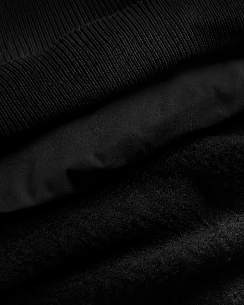
A black knit beside a smooth cotton shirt. Pale plaster behind a white ceramic bowl. Charcoal wool resting against polished stone. When colours are closely related, differences in surface become easier to appreciate.
Texture gives a monochrome composition depth. It separates neighbouring elements, changes the way light moves across them and invites attention beyond the overall silhouette.
A limited palette can hold a considerable range of detail.
I
What monochrome means
Strictly speaking, monochrome describes a composition based on one colour, including variations in its lightness and darkness. In everyday design, the term is also often used for combinations of black, white and grey.
Both approaches reduce the range of hues within a composition. That restraint gives other qualities more room to establish differences.
Shape, proportion and texture become especially useful. A ribbed black sleeve can remain distinct from a smooth black body panel even when their colours are closely matched.
II
Texture works at different distances
Some textures are immediately visible. A chunky knit, deep grooves or a strongly grained surface can be read from across a room.
Others emerge gradually. A fine weave, a brushed finish or a slight irregularity in yarn may only become apparent up close.
These scales of detail can work together. From a distance, a garment presents a clear silhouette. Closer inspection reveals the construction of its surface.
Consider both views when combining materials. The most interesting detail at close range may become almost invisible within the whole.
III
Light reveals the surface
Texture becomes visible partly through the way it catches light and creates shadow.
Raised threads produce small highlights along their edges. Recesses between them appear darker. On a smooth surface, the transitions may be broader and more continuous.
Light coming from the side often makes these differences clearer. More even lighting can soften their appearance.
This means a monochrome arrangement changes with its surroundings. Fabrics that look similar under flat indoor lighting may separate clearly beside a window.
IV
Matte and gloss create contrast
Surface finish offers another way to introduce variation.
A matte fabric scatters reflected light more broadly, while a glossy surface can produce distinct reflections. Placed together, they create different patterns of brightness even when their underlying colours are similar.
Imagine a black cotton shirt beside a polished leather accessory. The shirt presents a relatively quiet surface; the accessory catches sharper highlights as it moves.
The balance depends on scale. A small glossy element may provide enough contrast within a predominantly matte composition.
V
Weave and knit establish different rhythms
Woven and knitted fabrics offer their own surface patterns.
A smooth, tightly woven cotton may appear almost uniform at a distance. A ribbed knit introduces repeated lines. Linen can reveal variations in the yarn, while a brushed fabric creates a softer surface.
Combining these structures gives the eye a sequence to follow.
The differences do not need to be dramatic. A fine knit beside a plain woven fabric can provide a subtle change, especially when their colours are close.
VI
Give each texture a role
A composition can become difficult to read when several strong textures compete for attention.
Begin with a dominant surface across the largest area. Introduce a second texture to create separation, then assess whether another detail adds anything useful.
For an outfit, a smooth shirt might provide the foundation, with a textured outer layer contributing most of the visible variation. Footwear or an accessory can add a smaller change in finish.
This approach keeps the relationships clear. Each material contributes at a scale that suits the whole.
VII
Tone and texture work together
Texture can distinguish similar colours, while tonal differences can support that distinction.
A charcoal knit beside black woven cotton introduces two changes: surface and brightness. A pale grey layer beneath them creates a clearer separation again.
If everything appears to merge, adjust one relationship at a time. Try a more distinct texture, a lighter tone or a change in layering.
An entirely black outfit may need only one of those adjustments to make its individual parts easier to see.
VIII
Folds add another kind of detail
A fabric’s visible surface includes the shapes it makes in use.
A crisp material may produce clear, angular folds. A softer fabric can gather into smaller curves. A substantial knit may hold broader areas of volume.
These folds create highlights and shadows larger than the texture of the yarn itself. They help explain why two smooth fabrics can still look different when worn.
Assess texture alongside drape. How a material falls can contribute as much variation as how its surface feels.
IX
Texture carries beyond clothing
The same principles apply to rooms, objects and photography.
A pale room can gain depth through plaster, woven upholstery and glazed ceramics. A dark arrangement might combine stained timber, matte metal and textured fabric.
Their related colours connect the elements, while their surfaces give each a distinct presence.
Spacing remains important. Enough room between objects allows their outlines and finishes to be appreciated. A crowded arrangement can obscure the very differences that make the palette interesting.
X
Touch completes the impression
Visible texture suggests how something might feel, but appearance does not tell the whole story.
A fabric that looks coarse may feel surprisingly soft. A smooth surface may be firm or flexible. Finishes and construction influence those qualities.
Where possible, handle materials before judging their suitability. Notice how they feel against the skin, how readily they bend and whether their texture suits the intended use.
A successful combination needs to work physically as well as visually.
XI
A closer look
Gather three items in the same colour family: one smooth, one visibly textured and one with a slight sheen.
Place them together beside a window. Compare their appearance from a few steps away, then examine them closely.
Change the angle of the light or move one item into shade. Notice which differences remain clear and which disappear.
Finally, remove one item. This helps reveal whether each surface contributes something distinct to the arrangement.
Through the EUVRΛN lens
EUVRΛN’s restrained palette gives fabric and finish a visible role.
A subtle weave, a smooth panel and a carefully finished seam can introduce variation within black, white and neutral tones. The silhouette establishes the overall form; texture rewards a closer look.
A small red detail provides a point of recognition, while the materials carry much of the design’s character.
Quiet. Minimal. Timeless.
← Back to Materials & Texture