
The Design Code / Form & Space
Symmetry & Asymmetry
Two approaches to balance. Mirrored forms, unequal arrangements and the relationships that hold them together.
A shirt fastened down the centre. A doorway framed by matching windows. A single chair beside a wide expanse of wall. Each arrangement has a different way of distributing attention.
Symmetry creates correspondence around a line or a centre. Asymmetry introduces differences between parts. Both can produce balance, depending on how shape, scale, colour and space work together.
Understanding them helps explain why some designs feel settled, others directional, and many somewhere in between.
I
Symmetry establishes a clear structure
The most familiar form of symmetry is reflection: one side mirrors the other across an axis.
A pair of sleeves, the two halves of a collar or matching windows beside a doorway can establish this relationship. The centre line becomes a reference that connects the parts.
This correspondence makes an arrangement relatively easy to follow. Once we recognise one side, the other offers a similar structure.
The effect depends on context. A symmetrical design may feel formal or calm, but its materials, colours and proportions can give it many other qualities.
II
Symmetry can take different forms
Reflection is only one way to organise corresponding elements.
Rotational symmetry occurs when a shape or arrangement repeats around a centre and matches itself after a turn smaller than a full rotation. A simple four-spoke wheel provides a familiar example.
Repeated motifs can also create order across a surface. A regular textile pattern, for instance, may combine several kinds of symmetry within its repeat.
These structures connect parts through consistent relationships. Their character changes with the number of elements, their spacing and the shapes they create between them.
III
Asymmetry creates different relationships
An asymmetrical composition does not mirror itself across the relevant axis.
A pocket on one side of a shirt, an offset entrance or a photograph placed beside a narrow column of text introduces an unequal arrangement.
That difference gives the eye more than one kind of information to consider. Attention may move from a larger element to a smaller one, or from a dense area towards an open space.
Asymmetry can be subtle. A single displaced detail may be enough to change an otherwise regular composition.
IV
Balance depends on visual weight
Visual balance concerns how attention is distributed across a composition. It does not require equal dimensions on each side.
A large, pale shape may be balanced by a smaller, darker one. Several small objects can form a group that relates to one substantial object elsewhere. A bright accent may attract attention beyond what its size suggests.
Colour, contrast, texture, detail and isolation all influence visual weight. Their effect also depends on the background.
This is why measuring size alone cannot tell us whether an arrangement will feel balanced. The elements need to be assessed together.
V
Position changes the balance
Moving an element changes its relationship with everything around it.
A small mark placed near the centre of a page may feel closely connected to the main content. Move it towards the edge, and the gap between them becomes more prominent.
In an asymmetrical arrangement, these distances help organise the whole. A larger element on one side can relate to a smaller, more isolated element on the other.
There is no fixed formula for the correct placement. Adjust position gradually and notice how the surrounding spaces change as well as the objects themselves.
VI
The two often work together
Many designs combine a symmetrical foundation with asymmetrical details.
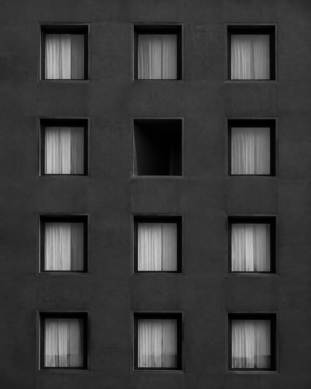
A shirt may have matching sleeves and a centred opening, with a pocket on one side. A building may use a regular window arrangement while placing its entrance off-centre. A page may follow a consistent grid while giving an image more space than the accompanying text.
The regular structure provides continuity. The variation establishes a particular feature or responds to a practical need.
This combination allows a design to remain coherent while accommodating differences.
VII
Function can determine the arrangement
Symmetry and asymmetry often emerge from how something needs to work.
A pair of handles may support an object evenly. A single handle may be positioned for a particular grip. A pocket may sit where its contents are easiest to reach, while a fastening may follow the movement needed to open a garment.
In buildings, room layouts and circulation can influence the placement of openings. In page design, the amount and order of information can determine the composition.
Begin with those needs. The visual arrangement should support the way the design is used.
VIII
Materials introduce natural variation
A geometrically symmetrical form can still contain differences across its surface.
The grain in a timber panel may vary from one side to the other. Stone can contain irregular veins. Fabric may fold differently around each arm, even when the sleeves share the same pattern.
These variations affect the way we perceive the finished object. The underlying structure remains regular, while the material introduces a less predictable layer.
Looking at both levels helps explain how a precise design can still feel varied and tactile.
IX
Clothing changes with the wearer
A garment’s symmetry is clearest when it lies flat. On the body, posture and movement continually alter its appearance.
One elbow bends. A shoulder turns. An open overshirt falls differently on either side. The original construction remains, but the visible silhouette becomes uneven.
Styling adds further possibilities. A bag worn over one shoulder or a sleeve rolled to a different height introduces another shift.
Assess clothing while standing naturally and moving. Its balance belongs to the complete worn form, including the person inside it.
X
Choosing an approach
Symmetry is a useful starting point when corresponding parts, a clear centre or regular repetition serve the design.
Asymmetry offers flexibility when elements have different roles, sizes or requirements. It can also establish a focal point or guide attention through a sequence.
Try both arrangements before deciding. Centre an image, then offset it. Pair two objects, then replace one with a differently sized piece. Compare how clearly each version communicates its purpose.
The choice becomes easier when it responds to something specific.
XI
A closer look
Place two similar objects on either side of an imaginary centre line.
Adjust them until their positions mirror each other. Notice the regularity of the objects and the gaps around them.
Then replace one with a smaller object. Move it closer to the centre and then farther away. Try grouping it with a second small item.
Observe which arrangements feel balanced and what contributes to that impression: size, darkness, spacing or the relationship between the groups.
Through the EUVRΛN lens
EUVRΛN’s three-bar symbol has a centred, symmetrical structure. Each bar aligns around the same vertical axis, while their decreasing widths create a clear progression.
The red lower bar adds emphasis within that ordered form. Colour introduces a difference while the geometry maintains its correspondence.
In clothing, a balanced silhouette can accommodate an off-centre emblem, a pocket or a small contrasting detail. The whole remains clear, with enough variation to give it character.
Quiet. Minimal. Timeless.
← Back to Form & Space