The Design Code / Form & Space
Negative Space
Margins, gaps and open areas. How the space around something helps define what we see.
A single object on a shelf. The gap between two buildings. The margin around a line of text. Each has a shape partly defined by the space beside it.
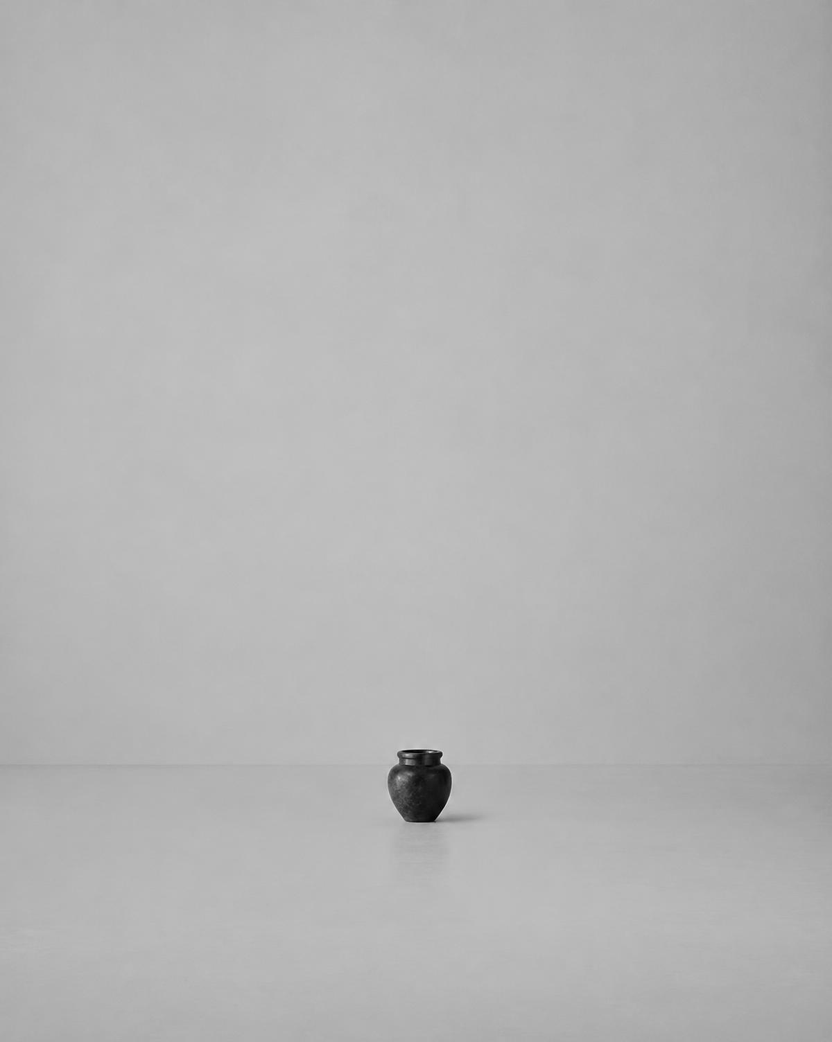
Negative space is the area around and between the main elements of a composition. It can also appear within them, such as the opening of a handle or the enclosed space inside a letter.
Paying attention to these areas changes how we understand design. We begin to see the object and its surroundings as parts of the same arrangement.
I
Space makes boundaries visible
An outline becomes easier to recognise when it has enough separation from nearby elements.
A dark chair against a pale wall reveals the shape of its back and legs. Place it among several similar chairs, and those boundaries become harder to follow. The object has stayed the same; the surrounding space has changed.
This relationship appears in clothing, photography and architecture. A gap between an arm and the body clarifies a silhouette. An opening between buildings gives each façade a distinct edge.
Look at the spaces around a form as carefully as the form itself. They help determine how clearly it can be read.
II
Empty areas have shape
Negative space can be narrow, broad, curved, angular or irregular.
Between the legs of a chair, it may form a series of triangles. Around a circular object on a square surface, it gathers differently at the corners. Between two people in a photograph, it changes with their posture and distance.
These shapes influence the composition even when they attract little conscious attention.
A useful exercise is to look past the objects briefly and trace the gaps. An awkward or cramped area can become more obvious when you treat it as a shape in its own right.
III
Spacing shows what belongs together
Distance helps communicate relationships.
Words placed close to a heading usually appear to belong to it. Objects gathered on one part of a shelf read as a group. A larger gap suggests a transition to something separate.
This makes spacing a practical tool for organising information. Within a page, smaller intervals can connect related elements, while larger intervals separate sections.
The differences matter more than generous spacing everywhere. When every gap is equally large, the relationships can become unclear. Space works best when it helps explain the arrangement.
IV
Room around an element gives it emphasis
An object can become more prominent simply by having fewer things close to it.
A small photograph on an otherwise bare wall may hold attention despite its modest size. A short sentence with generous margins can become the focus of a page. A discreet mark on plain fabric can remain easy to recognise.
The surrounding area gives the eye a clear place to pause.
Increasing an element’s size is one way to make it noticeable. Adjusting its surroundings offers another, often allowing the design to remain restrained.
V
Negative space does not need to be white
The term “white space” is often used in page design, but the space itself can be any colour.
A black background around pale lettering performs the same organising role as a white background around dark text. In photography, an area of shadow, sky or softly focused wall can provide space around the subject.
Texture can also be present. A quiet concrete surface may act as a background even though it contains grain and variation.
What matters is the role the area plays within the composition: whether it allows the main elements to remain distinct and readable.
VI
Space influences movement
In physical environments, open areas affect how people move and use objects.
The distance between a table and a chair determines whether someone can sit comfortably. Space around a doorway allows passage. The arrangement of furniture can create a clear route or interrupt it.
These gaps may contribute to the visual composition, but they also need to meet practical needs.
A room that looks spacious in a photograph may still be awkward to navigate. Assess the space through use: walking, reaching, opening and turning. Its success depends on the people who occupy it.
VII
Clothing creates changing spaces
The spaces around clothing shift with the body.
An open jacket frames the layer beneath it. The opening at a neckline creates a visible shape. A gap between a sleeve and the torso changes as the arm moves.
Room within a garment has a related practical role. Ease allows the fabric to sit away from the body, contributing to comfort and volume. This physical room influences the negative spaces visible around the silhouette.
A relaxed garment therefore needs to be understood in motion. Walking or turning can reveal relationships that are absent when it lies flat.
VIII
Restraint still needs balance
More empty space does not automatically improve a design.
Too little separation can make elements difficult to distinguish. Too much can disconnect information, make an object seem lost or require unnecessary movement through a page.
The useful amount depends on purpose and scale. A poster viewed from a distance needs different spacing from a garment label read up close. A display shelf has different requirements from a working kitchen.
Start with what needs to be seen, understood or used. Let those requirements guide the space around it.
IX
The edges matter too
The distance between an element and the edge of its setting can change the whole composition.
A photograph centred within a broad margin feels different from the same photograph placed close to one corner. A small object near the edge of a table creates a different relationship with the surface around it.
Unequal margins can introduce direction or emphasis. Similar margins can establish a more regular arrangement.
Check the outer boundaries as well as the internal gaps. The frame, wall, page or garment panel is part of the design.
X
A closer look
Place one small object on a clear table and photograph it from above.
Take a second photograph with the object closer to an edge. Then add another object, first nearby and then farther away.
Compare the shapes of the empty areas. Notice when the objects read as a pair, when they feel separate and where your attention lands.
The objects have barely changed. Their spacing has created several different compositions.
Through the EUVRΛN lens
The gaps between EUVRΛN’s three bars keep each form distinct while allowing the symbol to read as a whole. Spacing is part of its identity.
The same attention applies to a discreet emblem on fabric, the room around imagery and the placement of words on a page. Each element needs enough separation to be understood at its intended scale.
Within a restrained design, the surrounding space gives small details their presence.
Quiet. Minimal. Timeless.
← Back to Form & Space